PC
Lighthouses are magic. We all know that. That’s just science fact. What’s less clear is whether they’re good or evil magic, and I think it would be a fool who could decide either way. Having finished the magnificently named No One Lives Under The Lighthouse, I’m still not entirely sure if this one was good or evil. But gosh, something was very evil.
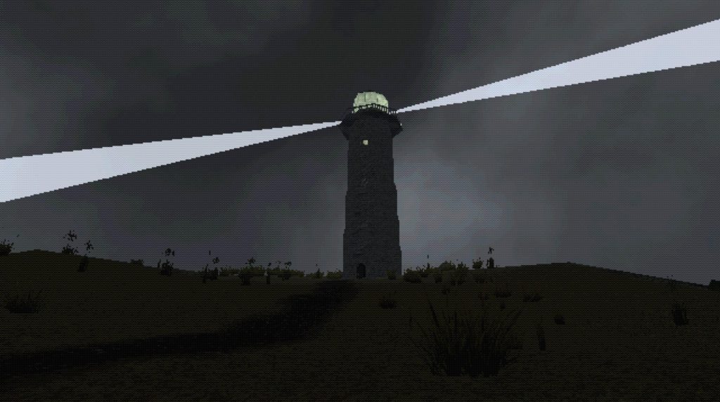
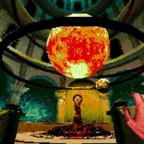
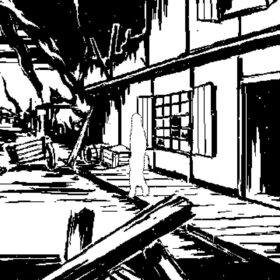
Created to look like a forgotten PS1 title to brilliant effect, this is a fantastically murky and dingy looking game, the graphics essentially dirty pointillism. It feels like it could have been one of those hundreds of Resident Evil knock-off games made on a fraction of the budget, that somehow manages to be all the creepier for how wrong it gets everything.
That’s certainly what the trio of developers at Sowoke were aiming for, and it’s a pleasure to report that in many ways, it gets this absolutely right. At around two or so hours long, this unquestionably feels like one of those ’90s games you remember playing and being deeply unnerved by, despite its clunky, clumsy ways.

Which is also to say, Under The Lighthouse is also clunky and clumsy, and I think not always by deliberate design. It begins absolutely splendidly, after a brief false start, as you arrive on a remote island tasked with manning the lighthouse for the foreseeable future. Your own job is to ensure the lamp is lit in the evening, and burns until morning, perhaps occasionally cleaning the glass exterior to make sure the light is clear to all. That’s it!
There’s even a nice little shack to live in, a bedroom and kitchen that feels homely, with a packed bookshelf, and even a spare bed. Sure, there’s a weird problem with oil patches appearing here and there, but it’d make for a lovely, remote break. Apart from all those scratching noises. And the way stuff keeps getting moved around. And the incessant looming horror.

The absolute finest thing about the game is the soundtrack. Think season three Twin Peaks ominous grinding dread. It’s awesome, terrifying, and knows when to rumble, and then to screech. This, accompanied by the game’s most subtle moments, caused me to grin with delighted fear. Something maybe flashing past the small lighthouse window as you ascend? A slight banging noise behind a door? The lamp not being where you put it last? If it had only maintained this from start to finish, this would have been exceptional stuff.
Instead it does end up rather getting carried away, and while avoiding spoilers, let’s just say that subtlety goes out the window. What had been a creepy, sinister experience, really suddenly stops being scary the moment it starts being BIG. Not least because these moments tend to be more poorly crafted, often leaving you repeating a section multiple times until every scrap of scary is beaten out of it.

It’s still fun! I rather liked how the story threads weave together, even as it gets over-excited and a little bit too cliche. But I do wish it could have played its cards closer to its teeth-filled chest, because the first hour really demonstrated their skill at this.
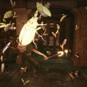
Oh the scene with the moths! It’s so very good. Moths are unequivocally evil. More science for you there. There are a lot of really excellent moments in here.

At such a low price, I really do recommend this for those looking for a janky horror kick, especially with how successfully it delivers on those spooky PS1 vibes. I’m very interested to see what this team does next.
- Sowoke Entertainment Bureau
- Steam
- £4/€4/$5
- Official Twitter
All Buried Treasure articles are funded by Patreon backers. If you want to see more reviews of great indie games, please consider backing this project.














I don’t have any nostalgia for the PS1 era, but this does look intriguing. And creepy. Even if the title makes me think it’s a NOLF/Shirley Jackson mashup.
Yeah I’m in the same boat, I like the sound of this (a Lynchian soundtrack particularly appeals to me).
in my opinion they failed to create a game with the PS1 aesthetic
I think they just played a few games on an emulator and tried to make it look the same without understanding all the technical part
Contrary to what this article says, they weren’t going for a ps1 aesthetic; they were going for an old pc aesthetic. Even if they were going for an old ps1 aesthetic, not every ps1 game looks exactly alike. Either way, if you want a ps1 game, go play a ps1 game.